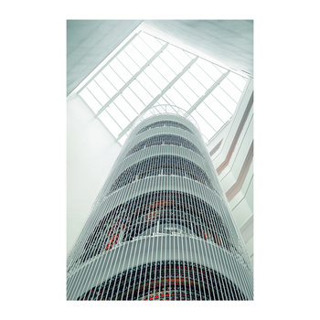
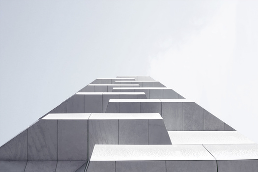
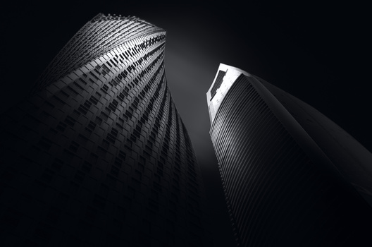
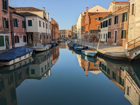
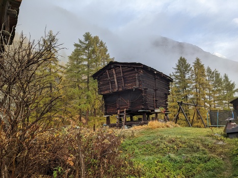
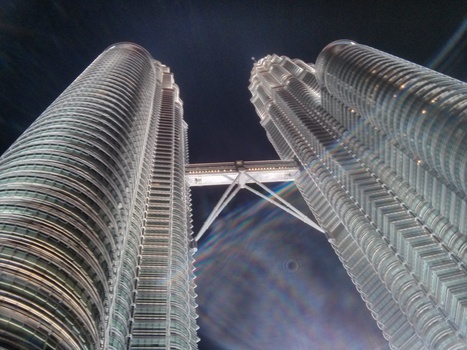
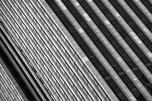
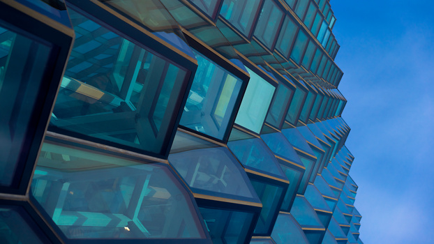
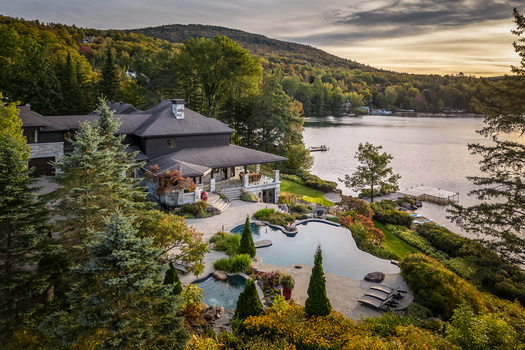
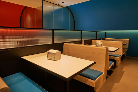
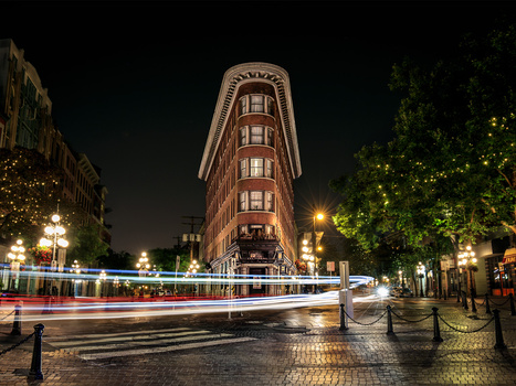
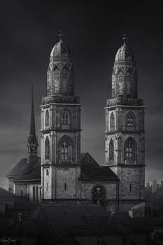
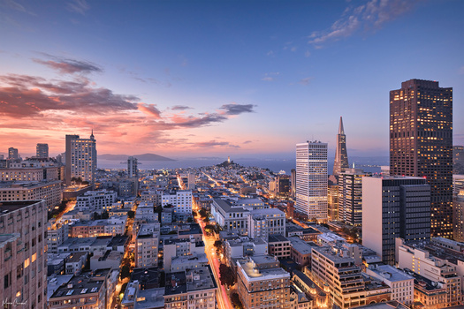
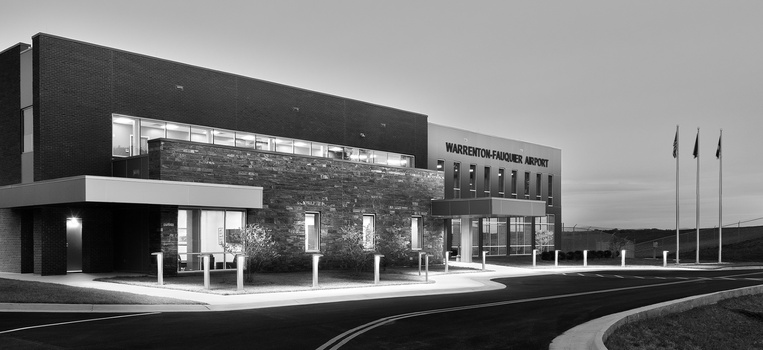
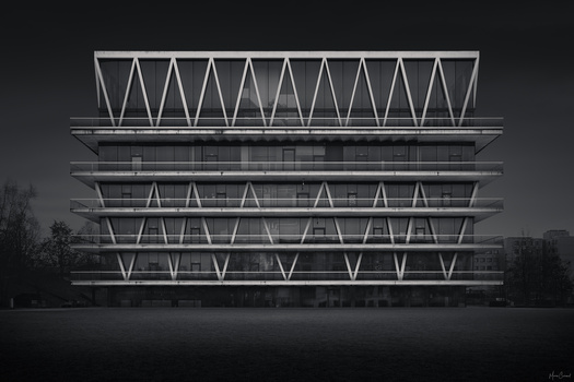
Here are the winners of February's architecture photography contest.
First place:
Second Place:
Every other photographer whose work was featured in this video wins a free tutorial in the Fstoppers Store. Each winner has 30 days to claim their prizes by sending me a private message, let me know what you've won, or what tutorial you would like.
This is your last chance to get our architecture photography tutorial and our wedding photography tutorial on sale for the lowest prices ever.
Join our next photography contest at Fstoppers.com/Contests


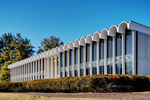
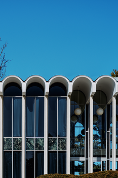
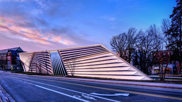

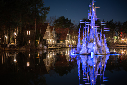


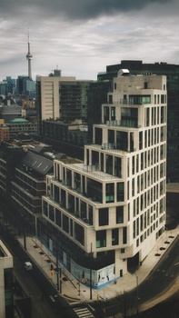
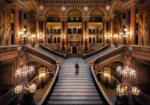
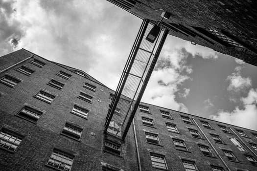
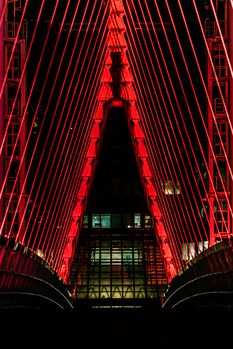
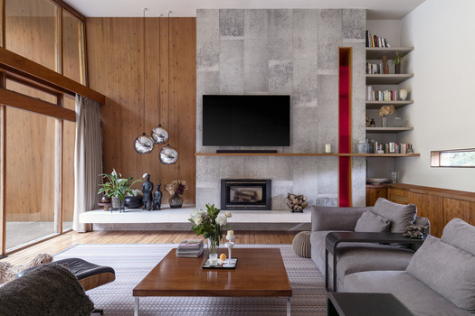
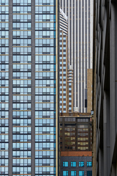
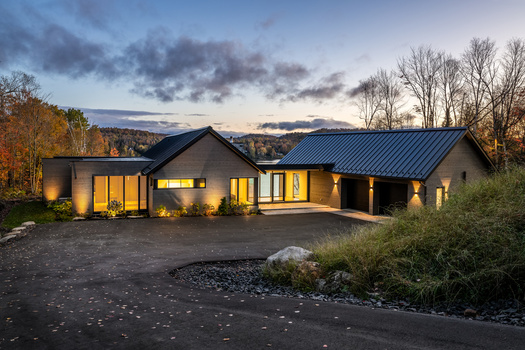
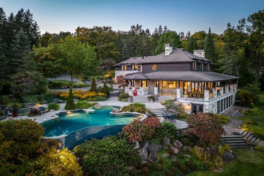



Interesting results. Seems like a lot of the chosen ones are landscape photos with a little bit of a building in the frame. Not nearly as focused on 'architecture' as I expected.
Exactly, I sincerely wanted to be amazed by the results and then buy the freaking tutorial to expand my current skill set, but in my opinion, it may hurt my professional work if this is the standard.
I work with the largest team of Architectural Photographers in the world. It is a major media company with a massive QA team and gloabal reach, in many ways we set the bar for the industry and that's all I am going to say about that. Here's what feedback they would give me if I submitted these photos (please note I also entered this contest for kicks but knew none of my old freelance photos would do well, I wish I could use the stuff I have from work in DTLA, anyway here's what my QA team would say about these winners:
First place (Monument Valley Photo): "This is a great photo, but we need shots of the building not the landscape." Even if I drove 500 miles to get this shot, they would send me back out to retake this to capture more of the building and less of the landscape.
It's a great photo but in my opinion the architecture is not the subject, Monument Valley is.
Second place, this is straight up a landscape photo. My team would say, "you need to go back and capture the architecture or crop out the landscape and resubmit."
Again beautiful photos, I aspire to take world class landscape photos like this but this being architecture is a huge stretch and has me questioning the logic here. Willing to be humbled here and I am definitely not saying I could do better but I am familiar with what fails and what passes as architecture and if we are the company that sells more architectural photos than any other in the world and we would only approve the second one as a context shot, I am not sure if we should call this something else? This would not sell with the clients I deal with, maybe appear in a snooty magazine but again I wish I could be more excited about these results as someone who does this every single day.
Couldn't agree more, especially on the Monument valley, this image even looks like it was captured from a phone....
It doesn't seem like a legitimate site for contests. There is a lot of soul missing from the 'winners'! The catagorization or themes, do not live up to the true meaning. Whomever is in charge of this whole thing should resign and be replaced with a proper process.
It makes me happy how much Mike hates the community votes.
Peter Wingfield's I think is Canada. He was real estate photographer of the year last year.
It's also amazing how the winner has absolutely 0 interest in this community. I don't know man this is really a weird choice especially having reviewed the contestants content.
Regarding the Monument Valley photo - I think it is spot on. I grew up in this area of the world and have been to that exact location - to me, it represents the feel of the Navajo Reservation being devoid of 5-star luxury in the midst of the most beautiful scenery in the world. You’ll see views like this and then have ketchup packets and plastic forks in front of you at what is a “nice” dining spot. Just making the tables exposed enough to see them and know what they are without overdoing it was perfect imho. The struggles of this area economically are real and where they want to present their best, they do with what they have. I personally enjoyed the stark dining area in the forground, as is, no fluff, no decoration - that is exactly what you get when you go here. No pretense surrounded by jaw-dropping beauty.