Minimalism is a word bandied about by some photographers and overlooked by many others. There’s so much more to it than excluding elements from our images, and embracing its wider meaning can transform the way we approach photography.
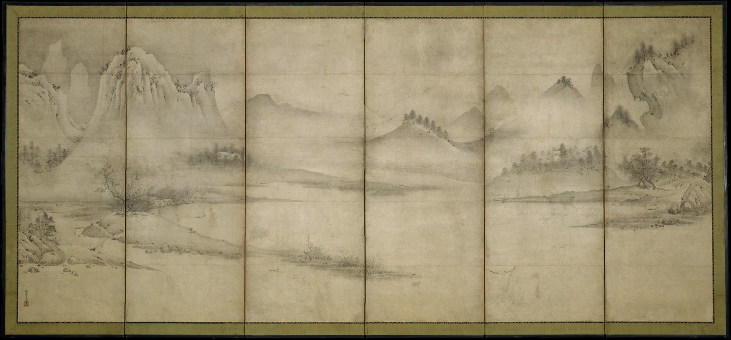
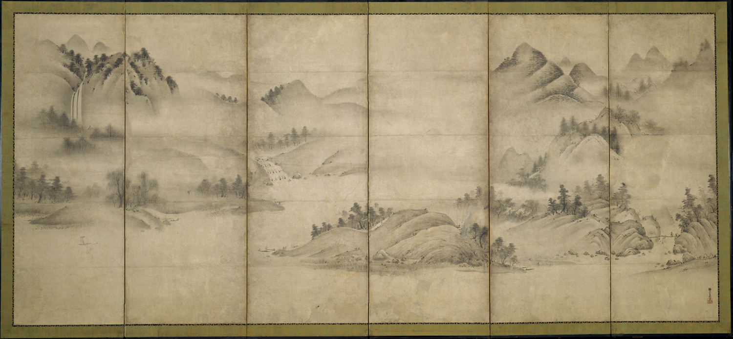
As the architect and last director of the Bauhaus, Ludwig Mies van der Rohe, said, “less is more.” However, minimalism isn’t just the reduction of elements in a picture, but also the rejection of all that is ornate. Like most art movements, it began in the West as a denunciation of what had come before it. In this case, partly, modernist art, like that of Pablo Picasso, who later went on to embrace minimalism. In Western art and design, it first appeared in America in the 1960s. However, it predates that. Under a different name, the style of excluding clutter from art and design had been an important part of Japanese culture for centuries. Look, for example, at the following picture.
The Landscape of the Four Seasons (Eight Views of the Xiao and Xiang Rivers) by Sōami, produced in the early 16th century, has a minimalist aesthetic typical of the Japanese culture for hundreds of years. It should be noted that the right-hand image should be viewed first, and from right to left. You can read the reason why here.
Like many art movements, that minimalist approach has its roots in philosophy. Zen Buddhism is concerned with reducing extraneous details from life. Meanwhile, in Western philosophy, the movement stems from the work of Gottlob Frege, and his philosophical examination of truth.
Within photography, minimalism is so much more than just excluding subjects from the frame. As with other visual arts, it can be considered that the image has its reality. With most photos we produce, we are depicting the world around us. Whereas, with minimalism, we are not trying to represent external reality, but asking the viewer just to respond to what is in front of them. Minimalist photographs have a refined beauty, representing a harmonious and simple order.
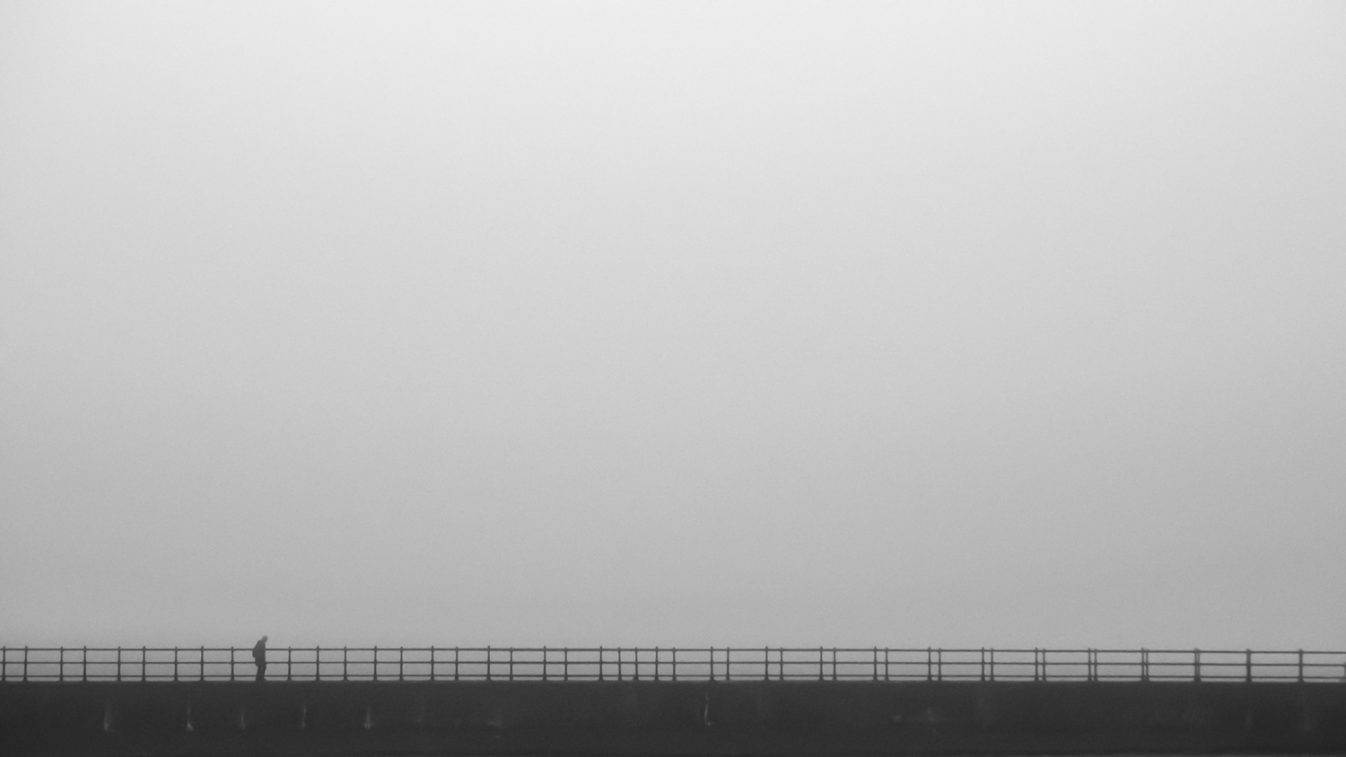
We are finding that beauty in the mundane and in unexpected things, often by highlighting abstract geometry. The images also have an honest quality, as they are not claiming to be anything more than what they are; they are not pretending to be something else. In minimalist photography, we are rejecting the depiction of reality.
To understand this principle, consider the following image. It is a sunrise over the sea, with the sun reflected in the water. The second is a crop of the same image. Without the context of the first image, the yellow line can lose meaning. It isn't necessarily the sun shining on the sea, just a yellow line across a textured surface.
Minimalist Photography Is Always Representative of Reality
There is a major difference between most minimalist art and minimalist photography. However hard we try for it not to be, a photograph is always a representation of the real world. Consequently, our minimalist images can, at first, just be geometric shapes, but on closer inspection or longer consideration, the subject becomes apparent. As accepted by modern Gestalt theory, our mind suddenly changes from seeing the shapes and patterns to the recognition of the subject. Accordingly, in our art, minimalism can also be considered a branch of abstract photography.
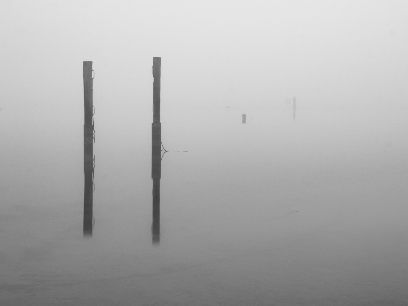
Using Minimalist Photographic Techniques
How can we introduce minimalism into our photography? Our approach to minimalism can be to capture either existing minimalist subjects or use camera techniques to achieve a minimalist result.

So, we can also look for subjects that are already minimalist, such as modern buildings, and even everyday possessions. The chances are that your cell phone, laptop computer, and some cameras are minimalist in design. Their form follows their function. Alternatively, there is a myriad of in-camera techniques including achieving a shallow depth of field, using long exposures, intentional camera movement, getting up extremely close or standing well away, shooting in fog, and using large areas of negative space.
Minimalism in Design
Within design and architecture, minimalism is the product of architect Louis Sullivan’s idea that form follows function. Taking this doctrine to its logical conclusion, all decoration and ornamentation become redundant. Inevitably, all that is left is stark negative space and the essential elements of the design.

Minimalism in architecture strips away decoration and reduces it to geometric shapes and negative space. One method of minimalist photography is to concentrate on aspects of a minimalist design.
Minimalism in design also differs from that of photography and the visual arts in that it is, in theory, a solution to maximize functionality. In art and photography, the minimalist approach is conceptual.
Minimalism in Everyday Life Is a Good Thing, Isn't It?
In recent years, adopting minimalism into everyday life has become in-vogue, and it is an approach not without its criticisms. Marie Kondo talks of ridding us of that which doesn’t "spark joy." It rang true to 11 million people who bought her Kon-Mari method book.
This approach is appealing. In the USA, households, on average, own over 300,000 things. Much of it is useless, just clutter that gets in the way. There’s something obscene about hoarding junk when so many people are homeless and starving. However, critics say that in attempting to achieve this minimalist style, we are creating “mountains of unwanted stuff” and, ironically, are needing to buy more things to fit with the minimalist aesthetic. Furthermore, that stark bareness can itself become overbearing and oppressive.
While some claim that in place of clutter, we are making room for time and creativity, others say that the space can restrict us.
Objects can be inspirational, and if we remove those objects from our lives, is that potential for creativity reduced? After all, many great creative minds were known for their untidy disarray of their workplaces: Beethoven and Einstein were renowned for their clutter and JK Rowling’s desk is famously messy. Research shows that while good health choices, generosity, and conventionality are typical of tidy minds, disorder produces creativity.
Is Enjoyment of Minimalism Subjective?
As with all things artistic, the enjoyment of minimalism in photography is subjective. I far prefer seeing photos with very simple compositions, and you may disagree. Nevertheless, herein lies a dichotomy. My appreciation of minimalist art and photography is at odds with my appreciation of ornate engineering, decorative architecture, and embellished design.
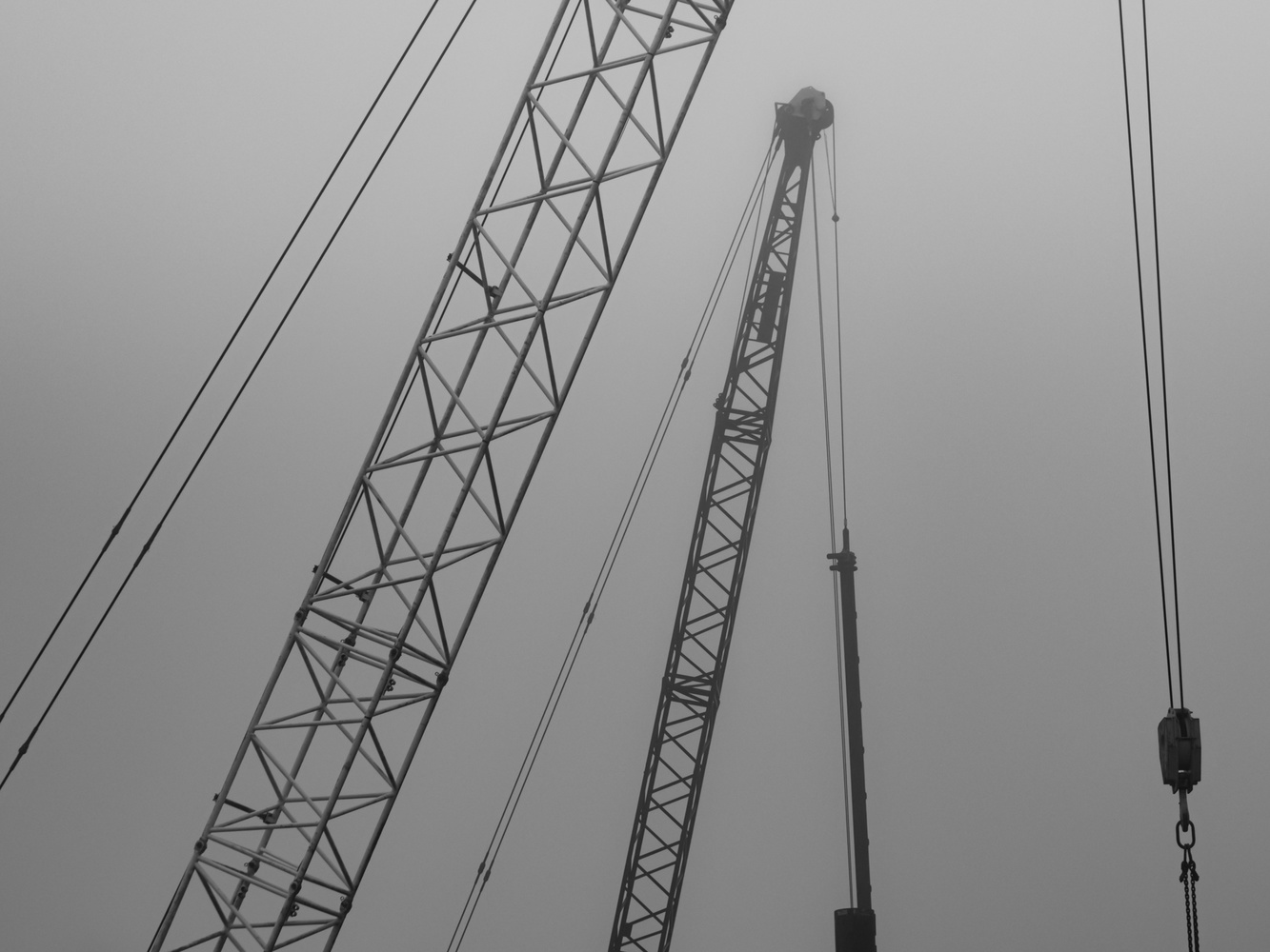
Form from function. Choosing an already minimalist structure as a subject can be one way of creating a minimalist image.
I believe that following minimalist principles in design, stripping away ornamentation, and sticking rigidly to the idea that form follows function, produces uninspiring bland ugliness. Thus, in architecture, I get a greater emotional response wandering through an ornate cathedral, mosque, temple, or palace than strolling the austere corridors of most modern edifices. Likewise, I am more inspired by my wife’s 19th-century writing bureau than a Panton chair.
I would rather look at a steam locomotive from the 1800s than a modern electric train. Similarly, classic cars are ornate things of beauty, whereas the simplicity of most modern automobiles is bland to look at. Then, compare the lines of the Mayflower with those of a cruise liner. Even the engineering of the Victorian sewage system in London, designed by Joseph Bazalgette, is a thing of beauty.
Furthermore, I believe that beauty and ornamentation are a function in themselves, therefore should be included in their form. For example, as I have written before, I far prefer using a camera that is inspiring to look at and use than a shapeless plastic lump. The strict adherence to form follows function often ignores that, but it's a concept that camera manufacturers have realized, with the OM System (Olympus), Fujifilm, and with their latest release, Nikon is catching onto.
However, contrary to my thoughts on design, removing extra elements from a photograph can usually improve it. The aesthetic of a simple, singular subject against a sea of negative space appeals to my mind’s eye. Does it yours?
This summary of minimalism is, of course, a generalization limited by the length of the article, and, as always, there are exceptions. It’s also a subjective view. But do you agree with me? Or are your views of minimalism the opposite of mine? I would be interested to hear your views.



Very nice, brief synopsis of minimalism. I often become frustrated with the view that minimalism in photography (and other visual arts) only means an overly simplified composition. it's so much more than that. In many articles on the subject, there is an alarming lack of historical context and understanding of minimalism. if this article was longer, it would be interesting to further explore the origins of minimalism as a reaction and response to abstract expressionism. That could lead to some interesting directions comparing nonrepresentational minimalist art to representational minimalist photography (or to nonrepresentational minimalist photography (as much as photography can be nonrepresentational)). Personally, I especially enjoy minimalism in all forms of visual art.
Thank you, Justin. I could write much more about it! I hope it gives a taste of the subject and others will delve into the subject and research more.
"La perfection est atteinte, non pas lorsqu'il n'y a plus rien à ajouter, mais lorsqu'il n'y a plus rien à retirer.” said Saint Exupery. "Perfection is achieved, not when there is nothing left to add, but when there is nothing left to take away."
Your articles differ much from the typical I don't know what to write about "10 reasons why..." articles and for that I am very grateful.
Thanks, Jan, that's very kind. The "10 reasons..." articles tend to have a larger readership. I have tried writing a couple like that, but I don't really enjoy writing them so much. That is a fabulous photograph, just my cup of tea!
Nice quote, but in reality, perfection is achieved when perfection is achieved, even if there might be something else to add or if there might be something else to take away. Just because someone makes a quote doesn't mean it's set in stone.
I don't think any of the rules of photography are set in stone. Good for contemplation and consideration though.
Firstly I enjoy reading your thought provoking articles. The whole modernist design movement was in part a rejection of Victorian over embellishment via the Arts and Crafts movement, and the ideas of Ruskin and Morris. As you rightly say Far Eastern art at the time influenced many artists designers and architects. Charles Rennie Mackintosh being a notable example. Post WW1 all this new approach to design was tempered and reshaped by the needs of industry to produce goods that were more process friendly, easier and cheaper to manufacture. Their aim being to satisfy the needs of the new emerging consumerism. The world was changing and the approach to design and manufacture in this new age of the machine also had to change. The minimalistic approach to design was driven in part by commercial and industrial pragmatism. The Bauhaus brought together all that thinking and produced a philosophy that conveniently packaged it neatly into a form that others could understand and run with. Others distilled these ideas down into their essence that resulted in modern minimalism. Though to be accurate minimalism has its roots much much farther back and can be found in the economical lines in early cave painting and in the earliest artefacts produced by our ancestors. Originally minimalism was a stripping down to the bare essentials born from the need to survive, life was hard. Today it’s a quest for aesthetic simplicity stripping away what’s not really needed to find the essence of beauty. Just as I can enjoy listening to both Chopin and AC/DC I can also appreciate all approaches to photography. There is no right way. The important question each image has to answer is “does it work”?
That's fascinating information, thank you Eric. I absolutely agree with your concluding line, and I think the answer to that question is, of course, both yes and no. The best part of all art for me is the subjectivity.
I am glad you enjoy my articles, and it's very good of you to say so.
You always put an interesting slant on things that makes one think. My first degree a long long time ago was in Industrial Design so the teachings of Walter Gropius were pretty central to what we did as was the history of art and design. If you look back at the earliest hand tools, form certainly followed function. Decoration and design elaboration only followed when time and resources allowed. Though a 100% minimalistic world would be a pretty cheerless place, but t does have its place in moderation.
To put it reasonably simple. It depends on the image and the viewer. It is all a subject of interpretation!
Indeed, Ivar, Thanks for that comment!
Excellent article, Ivor! I think there is a place for minimalism in portrait photography as well. In most of my work I use a plain white or grey background, and request my clients wear simple clothing with solid colors. I crop very close as well. All of this helps to remove distractions or unnecessary clutter, allowing the view to focus on the beauty of the face being displayed.
Yes, indeed, Pete. Simple portrait compositions hit the spot with me. Saying that, I also like portraits with backgrounds that add context to the shot, but it had to be well done. Thanks for the comment.
I would say there is a deal of difference between what could be considered a simple portrait to that of a minimalistic one. I’m not saying your own are not minimalistic as I’ve not seen any! All I’m trying to say is that the aesthetics of simple do not always equate to minimalistic. Ok I’m pedantic but there you go!
Eric, I agree. Simple or sparse isn’t always minimalism.
I agree with you both, and there is also an overlap too.
I really enjoyed this article. In my estimation minimalistic photography allows a real subject to be rendered in an abstract form without altering the reality of the subject. Many of the sample photos in the article illustrate this perfectly. Seeing the abstract form while taking the shot or later in post production is where the photographer is allowed to use their creativity.
Thank you, Paul. I am glad you enjoyed it.
Ivor Rackham asked,
"It’s also a subjective view. But do you agree with me? Or are your views of minimalism the opposite of mine? I would be interested to hear your views."
I would avoid using blanket statements about minimalistic photography. Why? Because minimalism can be one thing to one photographer, but another thing to another photographer. Also, minimalism can mean one thing to a photographer for a given image or project, but then mean something else entirely for that photographer's next minimalistic project.
For instance, minimalist photography can be, and often is, an interpretation of reality, and in such instances can be somewhat abstract or impressionistic. But to say that minimalism is always somewhat impressionistic or abstract would be wrong, because sometimes minimalistic images are actually realistic reproductions of reality.
Likewise, to say that minimalist photography always involves more than excluding superfluous elements from our images is a blanket statement that is not always correct. Why? Because there are times when minimalist photography is simply excluding elements from the composition, and doesn't go beyond that.
Minimalism photography can take on many different forms and be done to express things in a wide variety of ways. It encompasses many different types of photographic genres and styles. Hence, trying to define it in a way that limits it to any one thing is just wrong.
You are right, Tom. Thank you for the comment.
I believe that another word we could use additionally to 'minimalism' is 'mindfulness'. The joy I get from creating minimal photographs or looking at them is a mindful practice for me. Slowing down and focusing on certain elements of the environment can be a process of great joy for me that can
sharpen the mind. It can help me to see the bigger picture clearer, when focusing down on 'minimal' or specific elements. Minimalism is calming to me but also sparks my imagination and thought processes to grander places. It gets your mind working, when a creator doesn't give you all the details, you must use your mind to get creative and fill in to the gaps
Yes! Thanks for that, Alexis.
To me, not being a scholar of arts, photography simply needs concentration. That embraces minimalism as an art form, but not necessarily. It just means, for me, that I have to show my subject as effectively as possible.
Rene, so long as you are happy with your approach to photography, that's all that matters. It would be great to see some of your photos. (I think I've found you on YouPic, and they are fine images.)
My article is not meant to be prescriptive, but I hope it is informative and gives people a starting place to explore the topic. Another time it might be about compelling chaotic mess photos! Thanks for joining in the conversation.